
Introduction
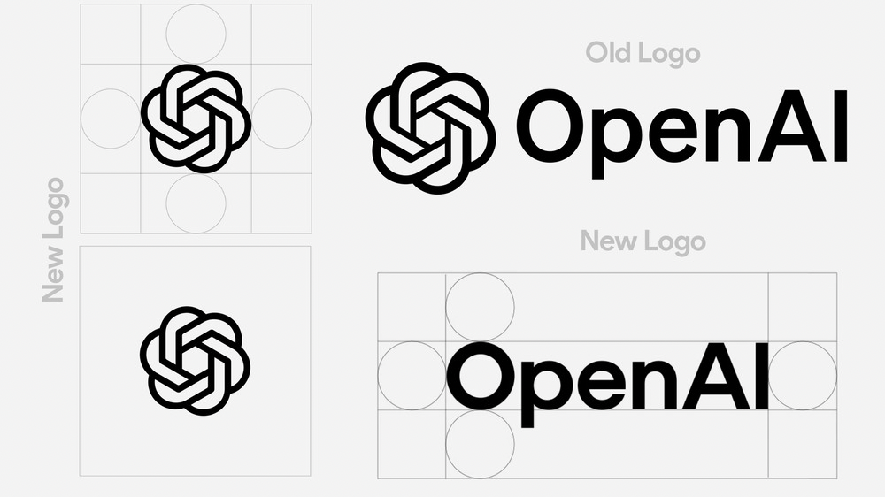
OpenAI has revealed its first major visual rebrand since ChatGPT became a global sensation in 2022. The update includes a new logo, refined typography, and a refreshed color palette, aiming to create a more organic and human-centric identity. According to OpenAI’s Head of Design, Veit Moeller, this transformation has been in the works for over a year, driven by CEO Sam Altman’s vision.
Key Changes in the New ChatGPT Design
The rebranding effort introduces several noticeable updates:
- Revamped Logo: A more streamlined and modern design.
- Updated Typography: New font-weight variations optimized for readability.
- Refined Color Palette: A softer, more inviting scheme to enhance the user experience.
Interestingly, OpenAI used ChatGPT only for font-weight calculations, leaving the creative process to human designers, emphasizing a balance between AI capabilities and human creativity.
Why This Update Matters
This visual overhaul comes at a crucial time for OpenAI, as it navigates:
- Rising Competition: Chinese AI powerhouse DeepSeek and SoftBank-backed AI ventures are making aggressive moves in the space.
- Legal Challenges: Ongoing disputes with Elon Musk add another layer of complexity.
- Strategic Expansion: Strengthening its brand identity amid market evolution.
How the Redesign Impacts Users
- Enhanced Readability: The typography adjustments improve content legibility.
- Better Brand Recognition: A more distinct visual identity strengthens OpenAI’s presence.
- User-Centric Approach: A design that feels more intuitive and engaging.
Final Thoughts
OpenAI’s redesign reflects a commitment to innovation, blending AI with human creativity to shape the future of digital interaction. As the AI landscape grows more competitive, this fresh visual identity reinforces OpenAI’s position as a leader in the industry.


