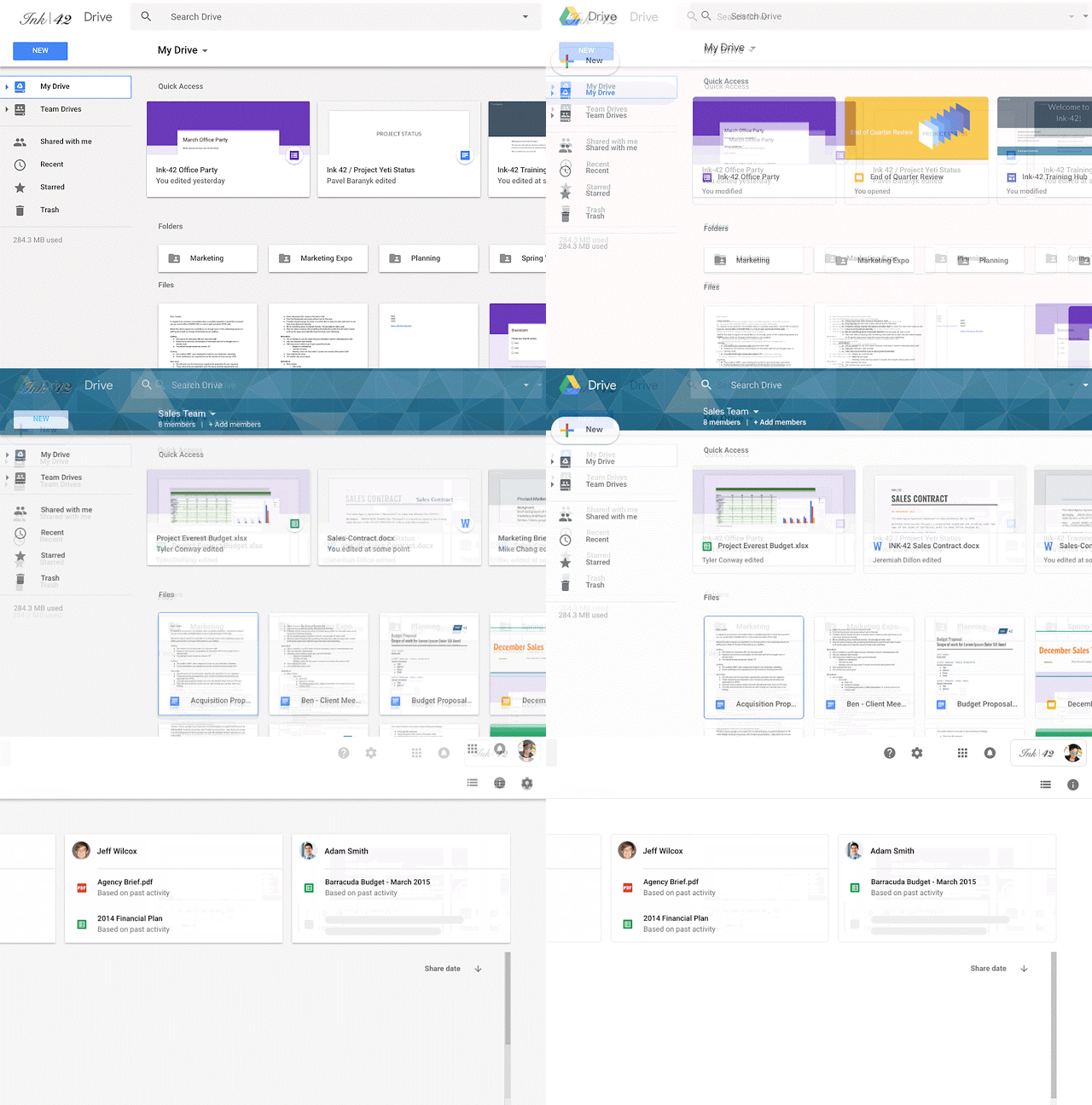
The freshest news today has to do with the google drive’s unique look which is said to have changed to match the Gmail’s design.
So, what’s different? Let’s analyze:
1. The google drive logo
The google drive logo now appears on the top left corner of the page. Well, that was the one concern we all felt Google had left out.
2. Company logo
If you have added a custom company logo to your google drive, the logo will now resemble the top right corner right ahead of the account display picture.
3. The setting and the help center icon placement
The setting and the help center icon have got a slight pull and are now aligned on standard with the search bar.
4. The background, the new button, and the header fonts
The page background has been changed into white, like the Google pixel’s white, and is not gray anymore. The new button has been redesigned to match the design of the G logo on Google’s search bar on our android phones which is Google’s trademark design. The font used for headers have now been changed. Previously, the font held a bit of bold texture but the new font is thinner and minimalist looking.
The company has told that it doesn’t change the way we use google drive.
The redesign only tweaks the color and icons and buttons placements.
“We built this new interface to create a responsive and efficient experience for Drive users, and to feel cohesive with other G Suite products,” -Google.


